Project Overview
Duration: Aug - Dec 2022 (15 weeks)
Team Members: Rosario Valdivia, Jackson Grey, Lillith Dorado, Emiliano Mendoza
Client: Horsehill Vineyards Wine
Role: Graphic Designer
Skills: Print Design, Visual Identity System, Packaging Design, Stakeholder Communication
Tools: Illustrator, Photoshop, Figma, Concept Board


What is Horsehill Vineyards?
Learn by Doing
Horsehill Vineyards is Cal Poly Pomona’s premier wine brand and annual collaborative student-led initiative. Each year, the grapes are grown and harvested by students of the College of Agriculture, processed and bottled into wine with the help of South Coast Winery in Temecula, then sold and poured by students of the College of Hospitality Management. The label and packaging are custom-designed by visual communication design students of the College of Environmental Design.
Learn more about Horsehill Vineyards Here
Interested in a Bottle? Buy it Here


Client Brief & Objectives
Collaboration & Difference
The objective of the project was to design a full visual identity for Cal Poly Pomona’s 2020 Zinfandel Rose wine including; label design, packaging, and additional promotional collateral. After a briefing with our client, Dr. Margie Ferree Jones, we discovered that a key issue was designing a wine label that could stand out on the shelf amongst competitors. Illustrating the collaboration between students was another important theme brought up.
Audience & Market Positioning
Keeping it Relevant
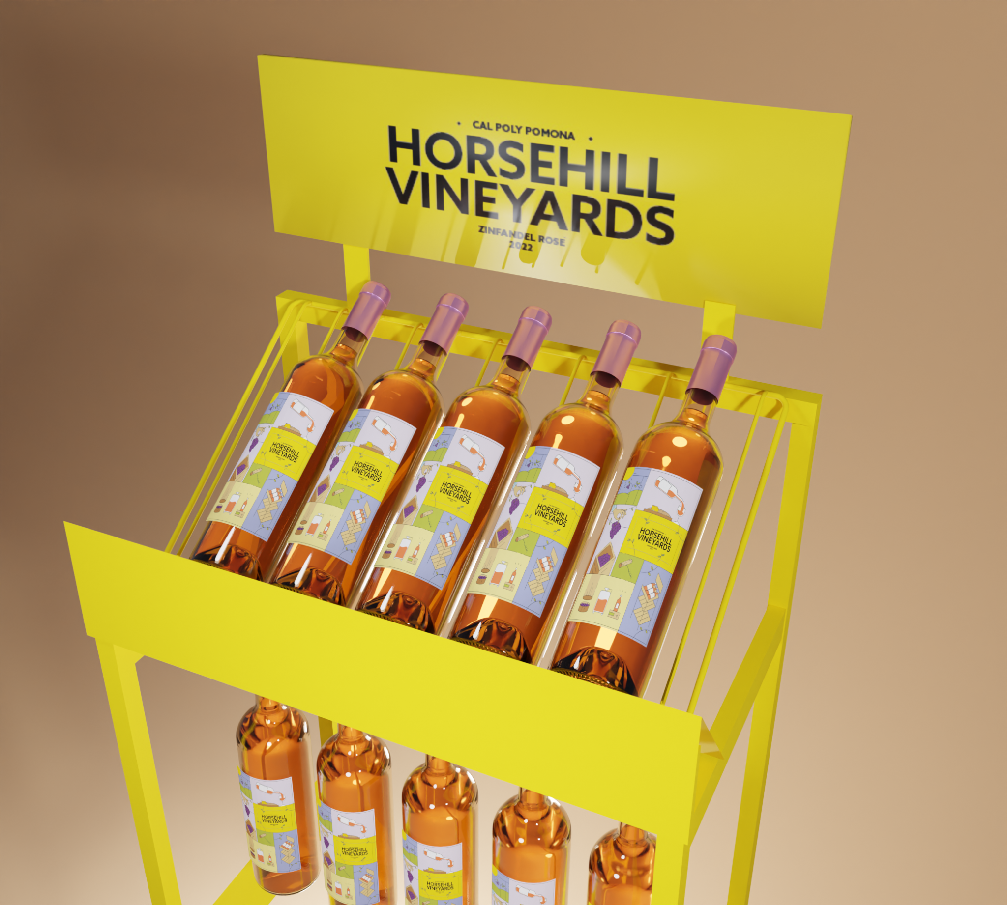
The primary audience of Horsehill Vineyards wine includes Cal Poly Pomona’s student body population of legal age, alumni, and visitors. Its points of purchase include the Farm Store on campus, Kellogg Ranch Restaurant, and Innovation Brew Works where they are sold. Knowing this, we needed to create a design that would appeal to both younger and older generations. Additionally, we needed to keep store display designs in mind.
Research & Analysis
SKU Audit
To better understand the variety and landscape of existing wine label designs in the market, we individually conducted a survey gathering 1000 SKUs of different wine label designs. This research helped us see what our competitors are doing and visualize common design patterns amongst different wine types and brands.
Research & Analysis
Class Research
The class was divided into groups to conduct wide-scale research about wine on topics ranging from the history of wine in California, flavor profiling, and user personas, to the process of making wine and the history of Horsehill Vineyards. We also conducted research about what a Zinfandel Rose is as well as the different types of wines.
Concept Development
Individual Sketches & Initial Ideas
The creative process involved creating a mood board from online inspiration and sketching concepts of elements and designs. Some of my initial concepts were inspired by stained glass windows and art deco geometry.
Concept Development
Group Brainstorming Concepts
Each member of the group created their own unique initial concepts, which we then gathered and discussed what we liked and what could be improved in order to decide how to move our concept forward.
Concept Development
A New Direction
After presenting our ideas, we received feedback from the class and decided that our best direction to go in would be working with the idea of Farm to Table.
Design Execution
First Draft
Ideating the concept of Farm to Table, we created the first sketch and outline of the front label and then experimented with adding color. We also ideated a few concepts for the back label.
Design Execution
2nd Iteration
The second iteration of the label involved adding a structured border as well as experimenting with a deeper color palette. We also adjusted the back label by using different icons to better represent the concept of Farm to Table.
Design Execution
Final Label
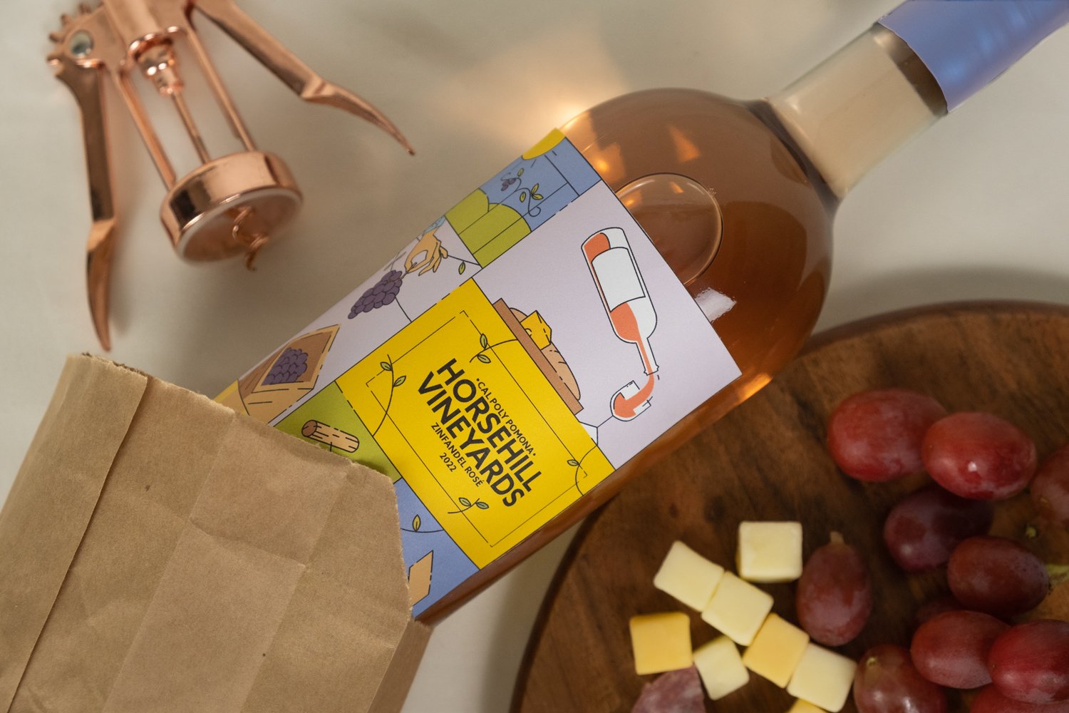
After receiving feedback from the class, the final version of the front and back labels implemented a refined color palette, design, and execution of collaboration.
Design Rationale
Farm to Table is Learn by Doing
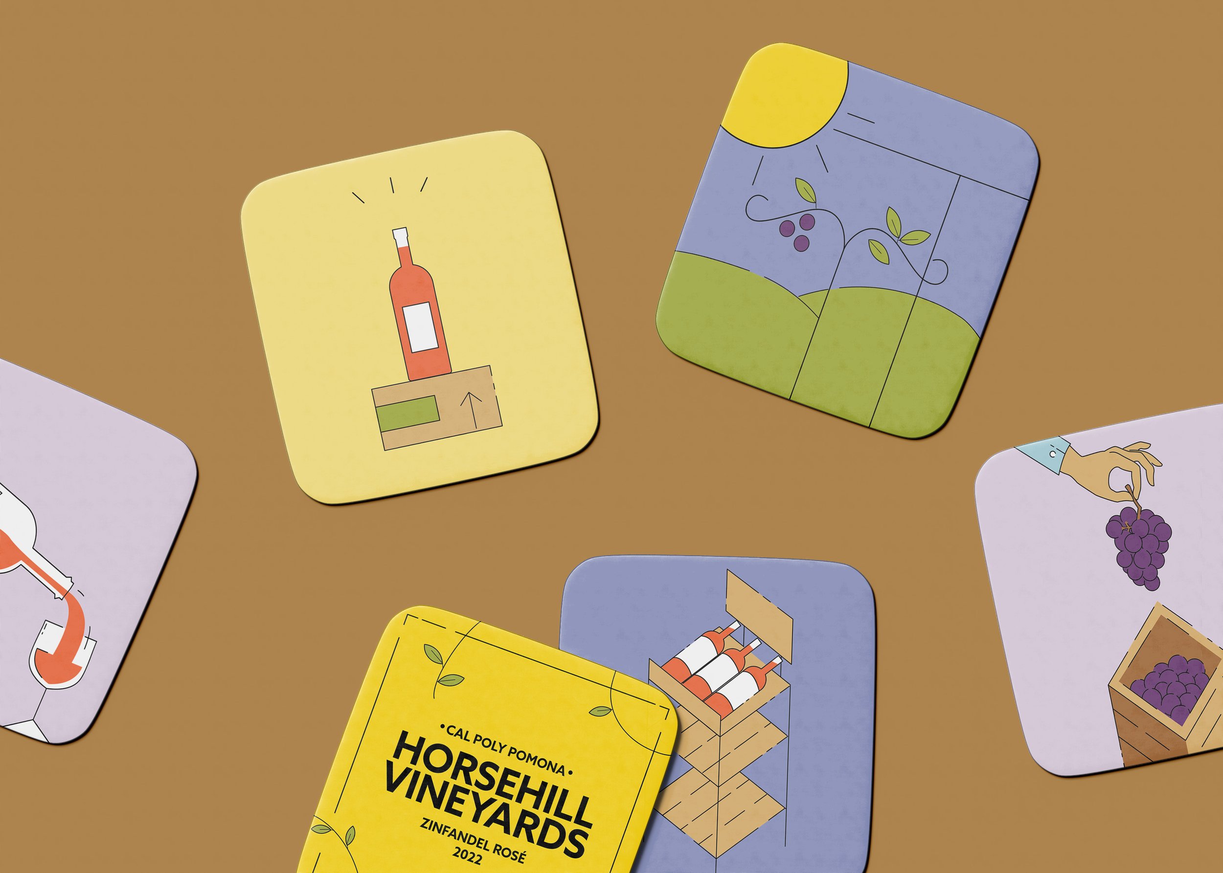
The design rationale behind our label concept was to show the process of how the wine is made by telling a story going clockwise of what it means to learn by doing. Emphasizing the steps involved, the people that care for the wine, and the learning and collaboration that is resulted are shown in the front and back labels.
Design Rationale
Imagery & Design Elements
Each of the panels represents a part that was played in the wine-making process including the Colleges of Agriculture, College of Hospitality, College of Environmental Design, and South Coast Winery. The typography used was chosen to reflect a modern and friendly brand.


